Have you ever wondered why some homes look effortlessly put together and stylish while others feel chaotic and disjointed? The secret may lie in something as simple as a unified color scheme. In this article, we will explore the beauty and impact of utilizing a cohesive color palette in home styling. By the end, you will be equipped with the knowledge and inspiration to transform your space into a harmonious and aesthetically pleasing environment. So, let’s dive into the world of unified color schemes in home decor and styling!

Understanding Color Theory in Home Styling
Color theory is the foundation of all art and design, including interior styling. At its core, color theory is the science and art of using color to create visual harmony. When it comes to home styling, understanding color theory can be a game-changer. By knowing the basics of color relationships, you can easily create a cohesive and balanced look in your space.
The Basics of Color Wheel
The color wheel is a fundamental tool in understanding color theory. It consists of twelve colors arranged in a circle, with primary, secondary, and tertiary colors. Primary colors – red, blue, and yellow – are the building blocks of all other colors. Secondary colors are created by mixing two primary colors, while tertiary colors are a combination of a primary and a secondary color.
Understanding how colors relate to each other on the color wheel can help you create color schemes that are visually appealing and harmonious. Whether you prefer monochromatic, analogous, or complementary color schemes, the color wheel is your guide to achieving a unified look in your home styling.
Benefits of a Unified Color Scheme
A unified color scheme brings numerous benefits to your home styling efforts. From creating a sense of cohesion and harmony to making a space appear larger and more put together, a cohesive color palette can transform the look and feel of your home. Let’s explore some of the key benefits of using a unified color scheme in home styling.
Cohesion and Harmony
One of the most significant benefits of a unified color scheme is the sense of cohesion and harmony it brings to a space. When all elements in a room are tied together by a common color palette, the space feels more organized and visually pleasing. Whether you opt for a subtle, neutral palette or a bold, vibrant one, a cohesive color scheme creates a sense of unity that ties the room together.
Visual Impact
A unified color scheme can have a powerful visual impact on a space. By choosing a consistent color palette for walls, furniture, accessories, and accents, you can create a cohesive look that draws the eye and makes a statement. Whether you want to make a room feel more spacious, cozy, or energetic, the right color scheme can help you achieve your desired visual impact.
Versatility and Flexibility
Another benefit of a unified color scheme is its versatility and flexibility. A cohesive color palette can easily adapt to different design styles and preferences. Whether you prefer a modern, traditional, or eclectic look, a unified color scheme provides a solid foundation that can be customized with different textures, patterns, and decor elements. This versatility allows you to experiment with different styles while maintaining a cohesive overall look.

How to Create a Unified Color Scheme
Creating a unified color scheme in your home styling doesn’t have to be complicated. With a few simple steps and some creativity, you can easily transform your space into a harmonious and stylish environment. Whether you’re starting from scratch or updating your current decor, here are some tips to help you create a unified color scheme in your home.
Choose a Dominant Color
Start by selecting a dominant color for your space. This color will set the tone for the rest of your color palette and serve as the anchor for your design. Whether you choose a neutral shade like white, beige, or gray, or a bold color like navy, emerald, or terracotta, your dominant color will form the foundation of your unified color scheme.
Determine Accent Colors
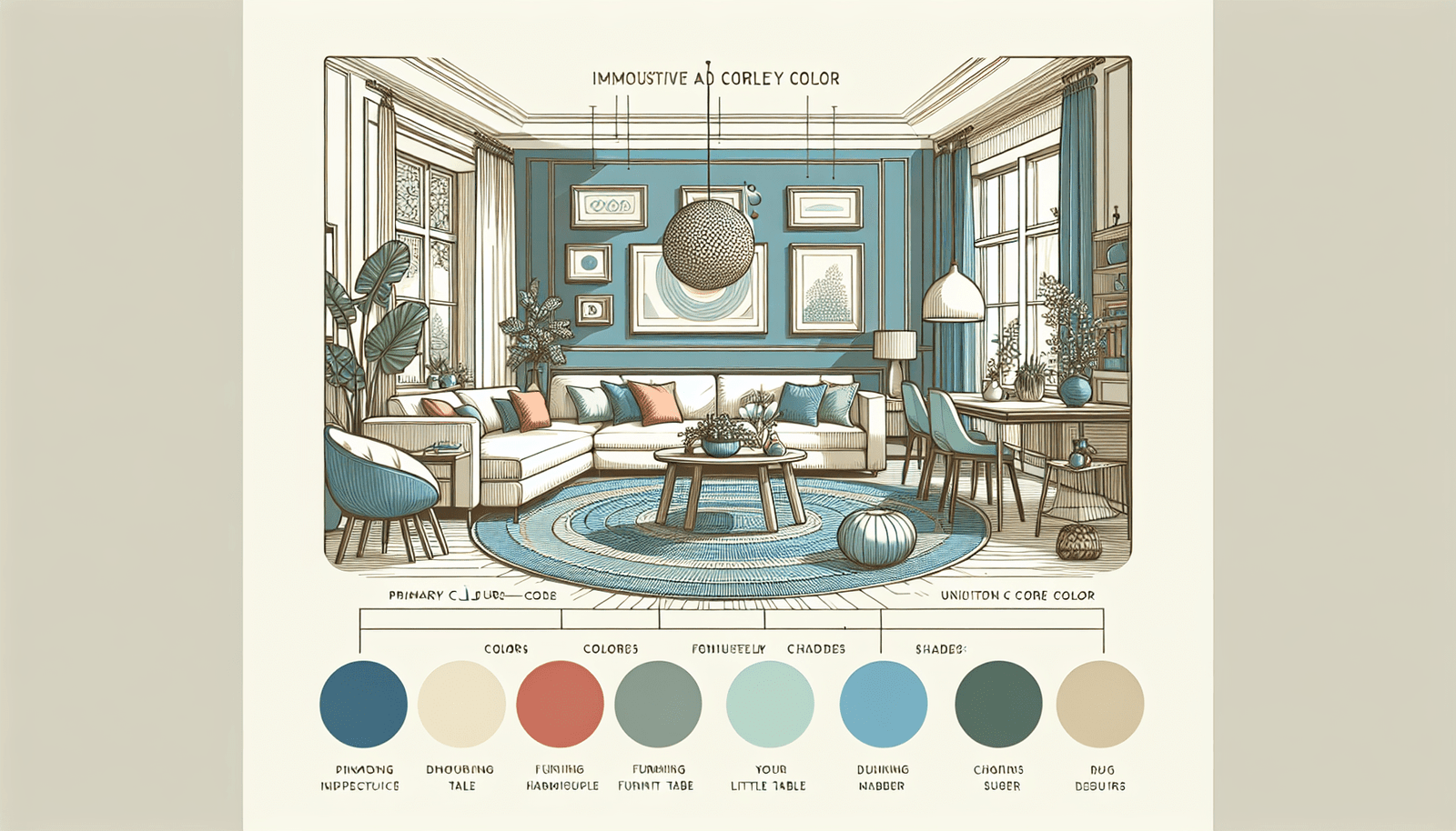
Once you have chosen a dominant color, consider selecting one or two accent colors to complement it. Accent colors add depth and interest to your color palette while creating visual contrast. You can choose complementary colors for a vibrant look, analogous colors for a harmonious look, or monochromatic shades for a subtle and sophisticated look. Experiment with different combinations to find the right balance for your space.
Consider Color Temperature
When creating a unified color scheme, pay attention to the color temperature of your chosen colors. Warm colors like red, orange, and yellow create a cozy and inviting atmosphere, while cool colors like blue, green, and purple evoke a sense of calm and serenity. Mixing warm and cool colors can add balance and dimension to your space, so consider the mood you want to create when selecting your color palette.
Use Color Samples
Before committing to a color scheme, it’s essential to test your chosen colors in the space. Paint samples on the walls, try out different fabrics and textures, and experiment with accessories and decor elements to see how the colors interact with each other. Lighting can also affect how colors appear in a room, so be sure to test your color palette under different lighting conditions to ensure it looks cohesive and balanced.
Balance Light and Dark Tones
A unified color scheme should include a balance of light and dark tones to create depth and contrast in a space. Light colors can make a room feel airy and spacious, while dark colors add drama and sophistication. By incorporating a mix of light and dark tones in your color palette, you can create a dynamic and visually interesting space that feels balanced and cohesive.
Layer Textures and Patterns
To enhance the visual appeal of your unified color scheme, consider layering textures and patterns in your space. Textures add depth and tactility to a room, while patterns create visual interest and break up the monotony of solid colors. Mix and match different textures like wood, metal, fabric, and glass, and experiment with patterns like stripes, florals, geometric prints, and abstract designs to add personality and character to your space.

Examples of Unified Color Schemes
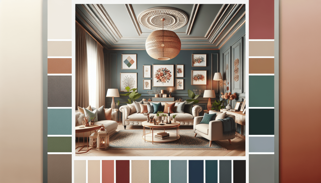
To help you visualize the impact of a unified color scheme, let’s explore some examples of cohesive and stylish color palettes in home styling. Whether you prefer a monochromatic, analogous, or complementary color scheme, these examples will inspire you to create a unified and harmonious look in your space.
Monochromatic Color Scheme
A monochromatic color scheme consists of different shades and tints of a single color. This type of color scheme creates a harmonious and sophisticated look that is both timeless and elegant. Whether you choose varying shades of blue, gray, beige, or green, a monochromatic color scheme can make a room feel serene and cohesive. Add texture and contrast with different materials and finishes to enhance the visual interest of a monochromatic palette.
Analogous Color Scheme
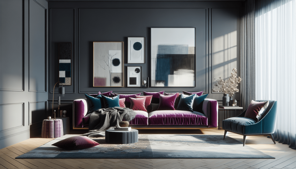
An analogous color scheme consists of colors that are adjacent to each other on the color wheel. This type of color scheme creates a harmonious and cohesive look that is easy on the eyes. Whether you opt for a mix of warm colors like red, orange, and yellow, or cool colors like blue, green, and purple, an analogous color scheme can bring a sense of unity and balance to a space. Experiment with different shades and tones within the same color family to create depth and visual interest.
Complementary Color Scheme
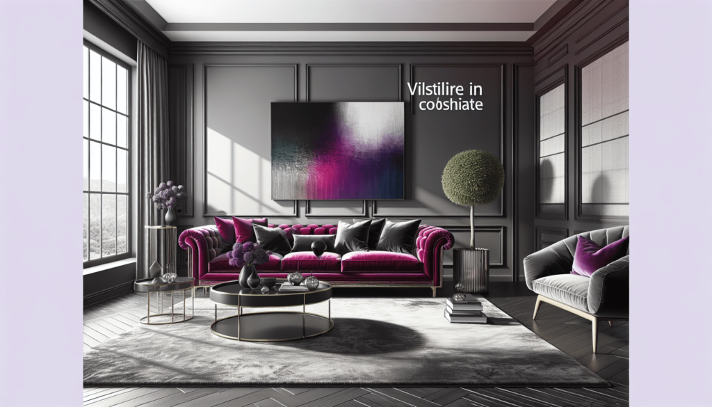
A complementary color scheme consists of colors that are opposite each other on the color wheel. This type of color scheme creates a bold and vibrant look that is full of energy and contrast. Whether you choose a classic pairing like blue and orange, red and green, or yellow and purple, a complementary color scheme can make a room feel dynamic and visually striking. Use one color as the dominant hue and the other as an accent to create a balanced and cohesive look.
Neutral Color Scheme
A neutral color scheme consists of colors like white, beige, gray, and black. This type of color scheme creates a versatile and timeless look that is easy to customize with different accents and accessories. Whether you prefer a minimalist, Scandinavian, or industrial style, a neutral color scheme provides a clean and sophisticated backdrop for any design aesthetic. Layer different textures and materials to add warmth and interest to a neutral palette and create a welcoming and stylish space.

Final Thoughts
In conclusion, the beauty of a unified color scheme in home styling cannot be overstated. By understanding color theory, embracing cohesion and harmony, and following simple steps to create a cohesive color palette, you can transform your space into a stylish and aesthetically pleasing environment. Whether you prefer a monochromatic, analogous, or complementary color scheme, the key is to choose colors that resonate with you and create a space that reflects your personality and style. With a unified color scheme, your home will not only look beautiful and put together but also feel inviting and harmonious. So, take your time, experiment with different colors, and have fun creating a space that reflects your unique taste and preferences. Happy styling!

