Have you ever struggled with choosing the perfect colors for your design projects? Whether it’s for a website, graphic design, or interior decorating, finding the right color palette can be overwhelming. But fear not, you are not alone! In this article, we will uncover the secret to creating a harmonious multi-color palette that will make your projects stand out. Let’s get started!
Understanding Color Theory
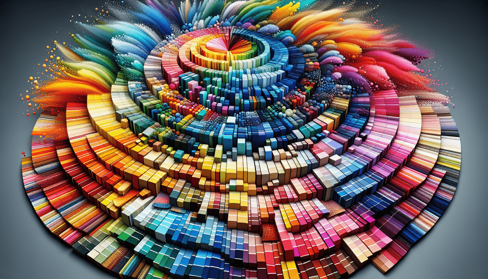
Choosing the right colors for your projects starts with understanding the basics of color theory. Color theory is the study of how colors interact with each other and how they can be combined to create pleasing visual compositions. By learning the fundamentals of color theory, you can make informed decisions when selecting colors for your design projects.
Color theory is based on the color wheel, which is a circular diagram that shows the relationships between colors. The color wheel is divided into three categories: primary colors (red, blue, yellow), secondary colors (green, orange, purple), and tertiary colors (yellow-green, red-orange, blue-violet). Understanding these color relationships will help you create a balanced and harmonious color palette.
Start with the Basics
When creating a multi-color palette, it’s important to start with a base color. This base color will serve as the foundation for your palette and will help guide your selections of additional colors. Choose a color that you love and that reflects the mood or message you want to convey with your design project.
Once you have chosen your base color, you can start building your palette by selecting complementary, analogous, or triadic colors. Complementary colors are opposite each other on the color wheel (e.g., blue and orange), analogous colors are next to each other on the color wheel (e.g., blue and green), and triadic colors are evenly spaced around the color wheel (e.g., red, yellow, blue). Experiment with different combinations to see what works best for your project.
Creating Harmony with Color Schemes
Color schemes are predefined combinations of colors that work well together and create a harmonious visual effect. There are several types of color schemes that you can use to create a multi-color palette for your design projects.
Monochromatic Color Scheme
A monochromatic color scheme uses variations of a single color, such as different shades, tints, and tones. This creates a harmonious and cohesive look, making it easy to achieve a sophisticated and elegant design.
Analogous Color Scheme
An analogous color scheme uses colors that are next to each other on the color wheel. This creates a smooth and serene palette that is pleasing to the eye. Analogous color schemes are perfect for creating a calming and cohesive design.
Complementary Color Scheme
A complementary color scheme uses colors that are opposite each other on the color wheel. This creates a bold and dynamic contrast that can make your design pop. Complementary color schemes are great for creating high-impact and visually striking designs.
Triadic Color Scheme
A triadic color scheme uses colors that are evenly spaced around the color wheel. This creates a balanced and vibrant palette that is visually appealing. Triadic color schemes are versatile and can be used to create a variety of moods and styles in your design projects.

Utilizing Color Tools
In the digital age, there are numerous color tools available to help you create the perfect multi-color palette for your projects. These tools can assist you in selecting colors, generating color schemes, and even testing color accessibility for web design.
Color Wheel Generators
Color wheel generators are online tools that allow you to easily explore different color combinations based on color theory principles. You can input your base color and generate complementary, analogous, or triadic color schemes with just a few clicks. These tools are great for experimenting with colors and finding the perfect palette for your project.
Adobe Color
Adobe Color, formerly known as Adobe Kuler, is a popular color tool that helps you create color schemes with ease. You can explore thousands of color palettes created by other users, or you can create your own custom palette using the color wheel or color rules. Adobe Color also provides accessibility tools to ensure that your color choices are accessible to all users.
Coolors
Coolors is a color scheme generator that allows you to create custom color palettes in seconds. You can lock in colors that you like and generate new colors to complete your palette. Coolors also provides options for exporting your color scheme as a PDF, image, or text file, making it easy to share with colleagues or clients.
Color Contrast Checkers
Color contrast checkers are essential tools for web designers to ensure that text is legible and accessible to all users. These tools allow you to test the contrast between text and background colors to meet accessibility standards. By using a color contrast checker, you can ensure that your design is inclusive and user-friendly.
Implementing Your Color Palette
Once you have created the perfect multi-color palette for your design project, it’s time to implement it across all aspects of your work. From branding to marketing materials to digital assets, consistency is key when using color in your designs.
Branding
Your color palette plays a crucial role in defining your brand identity. Use your multi-color palette consistently across all branding materials, including logos, business cards, and signage. This will help establish brand recognition and create a strong visual presence for your business.
Marketing Materials
When creating marketing materials, such as flyers, brochures, or social media graphics, use your color palette to create a cohesive and professional look. Incorporate your base color and complementary colors to highlight important information and create a visually appealing design that captures the attention of your audience.
Digital Assets
For web design, use your color palette to create a visually engaging and user-friendly experience for visitors. Incorporate your colors into website elements, such as buttons, links, and backgrounds, to create a cohesive design. Test your color choices for accessibility and ensure that your design is inclusive for all users.

Tips for Using Color Wisely
While color can enhance the visual appeal of your design projects, it’s important to use it wisely to create a harmonious and balanced composition. Here are some tips for using color effectively in your designs:
Limit Your Color Palette
To avoid overwhelming your audience, limit your color palette to a few complementary colors that work well together. Too many colors can create visual chaos and detract from the overall message of your design.
Use Color to Communicate
Color can evoke emotions and convey messages without words. Use color strategically to communicate the mood or message of your design project. For example, warm colors like red and orange can create a sense of energy and excitement, while cool colors like blue and green can evoke calmness and tranquility.
Consider Color Psychology
Color psychology is the study of how colors can influence human behavior and emotions. When selecting colors for your design projects, consider the psychological effects that different colors can have on your audience. For example, yellow is often associated with happiness and optimism, while black can convey sophistication and mystery.
Test Your Color Choices
Before finalizing your color palette, test your colors across various platforms and devices to ensure consistency and accessibility. Use color contrast checkers to verify that text is legible and easy to read, especially for users with visual impairments. By testing your colors, you can ensure that your design is both visually appealing and user-friendly.
Conclusion
Creating a harmonious multi-color palette for your design projects doesn’t have to be a daunting task. By understanding color theory, utilizing color schemes, and implementing your palette effectively, you can create visually stunning designs that capture the attention of your audience. Remember to use color wisely, test your choices for accessibility, and stay true to your brand identity. With these tips in mind, you can unlock the secret to creating a harmonious multi-color palette that will elevate your design projects to new heights. Happy designing!